How can you use color to effectively
guide users?
How can you use color to effectively guide users?
How can you use color to effectively guide users?
Movie Date is my design for the "Effective Use of Color" assignment. The goal of this assignment was to design an interface for a self-developed app where the user would understand how the interface should work through color. I was only allowed to use a primary color, a secondary color, and accent colors. It had to be clear, with only a minimal number of different colors, how the app should be used and what options the user has.
Movie Date is my design for the "Effective Use of Color" assignment. The goal of this assignment was to design an interface for a self-developed app where the user would understand how the interface should work through color. I was only allowed to use a primary color, a secondary color, and accent colors. It had to be clear, with only a minimal number of different colors, how the app should be used and what options the user has.
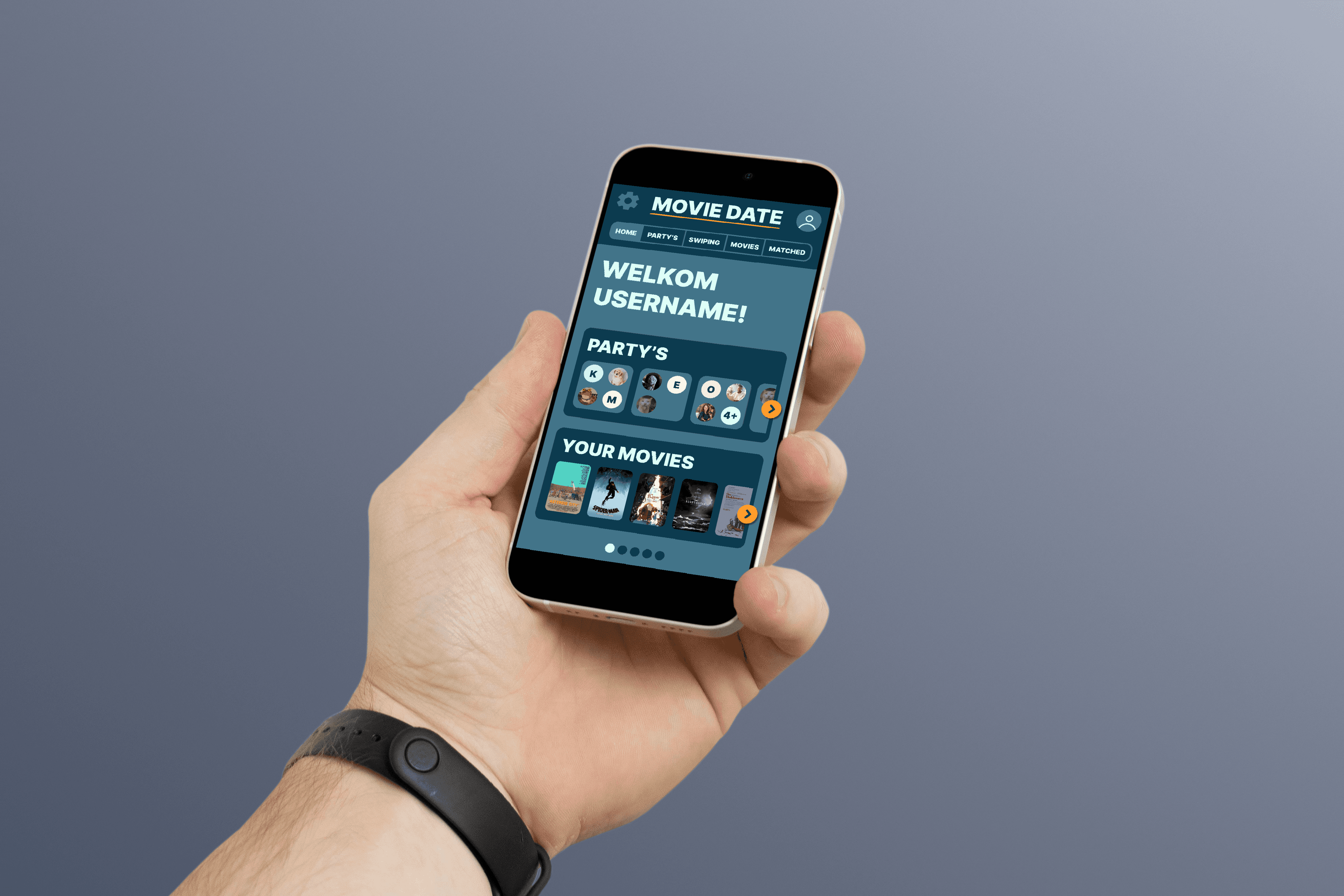
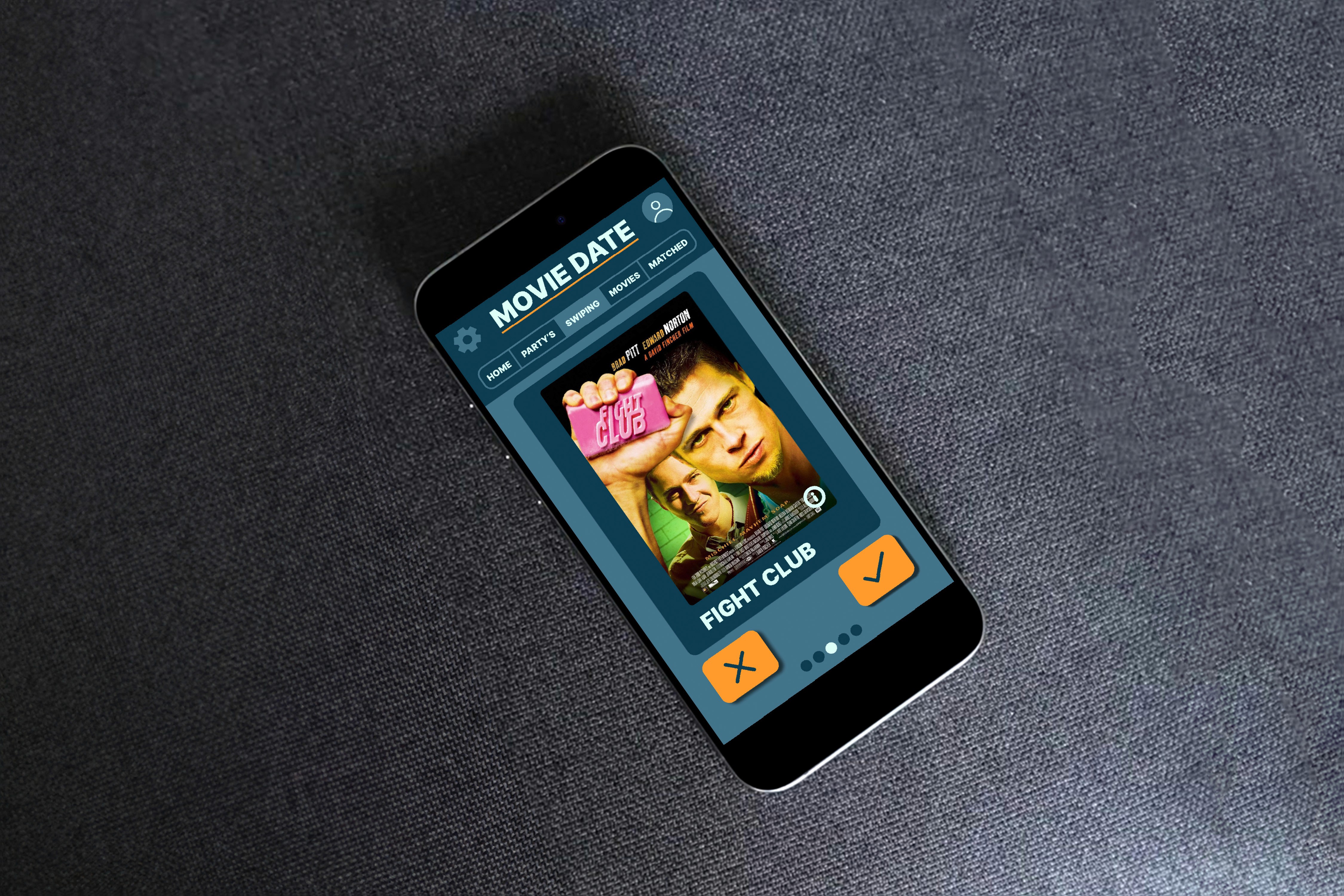
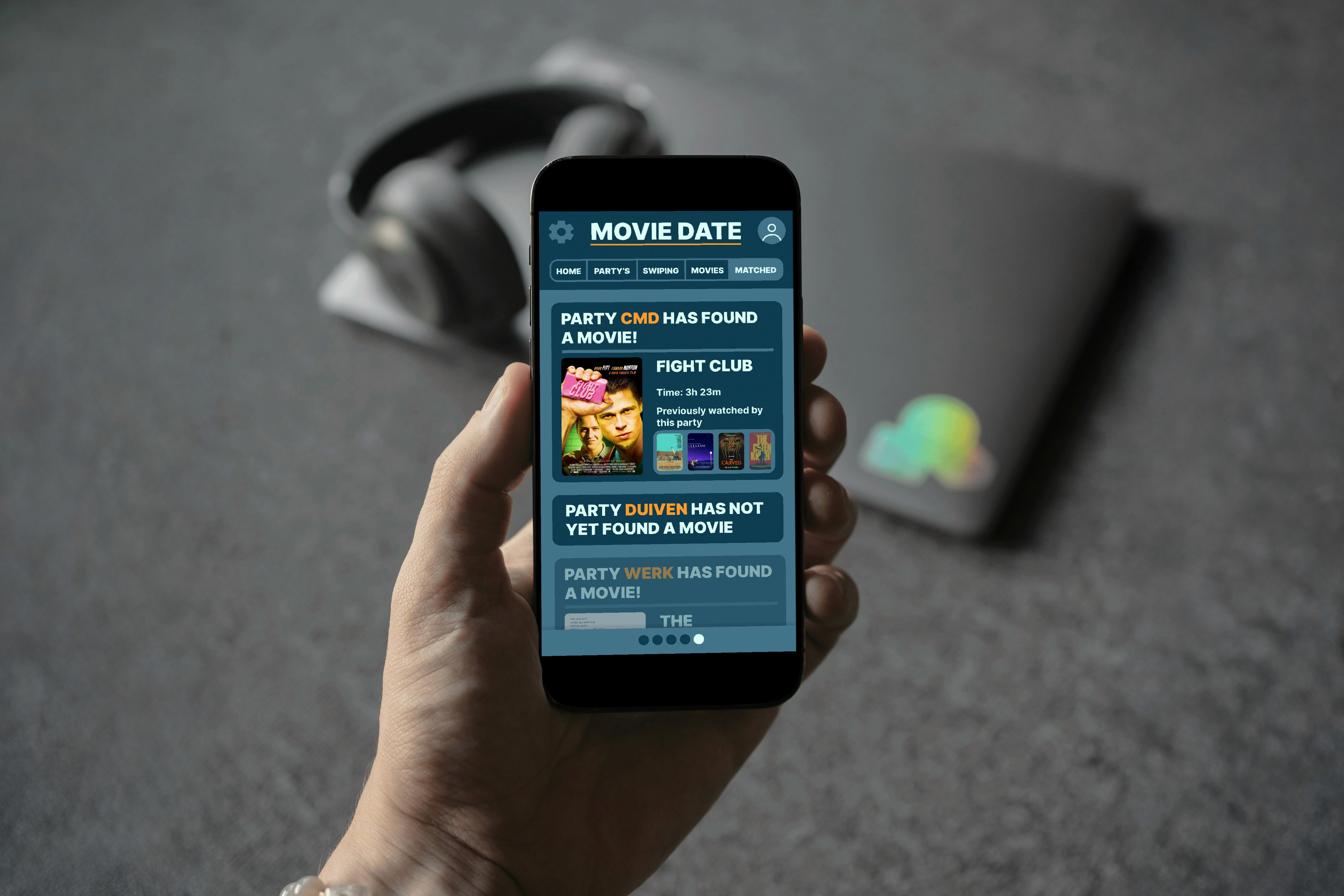
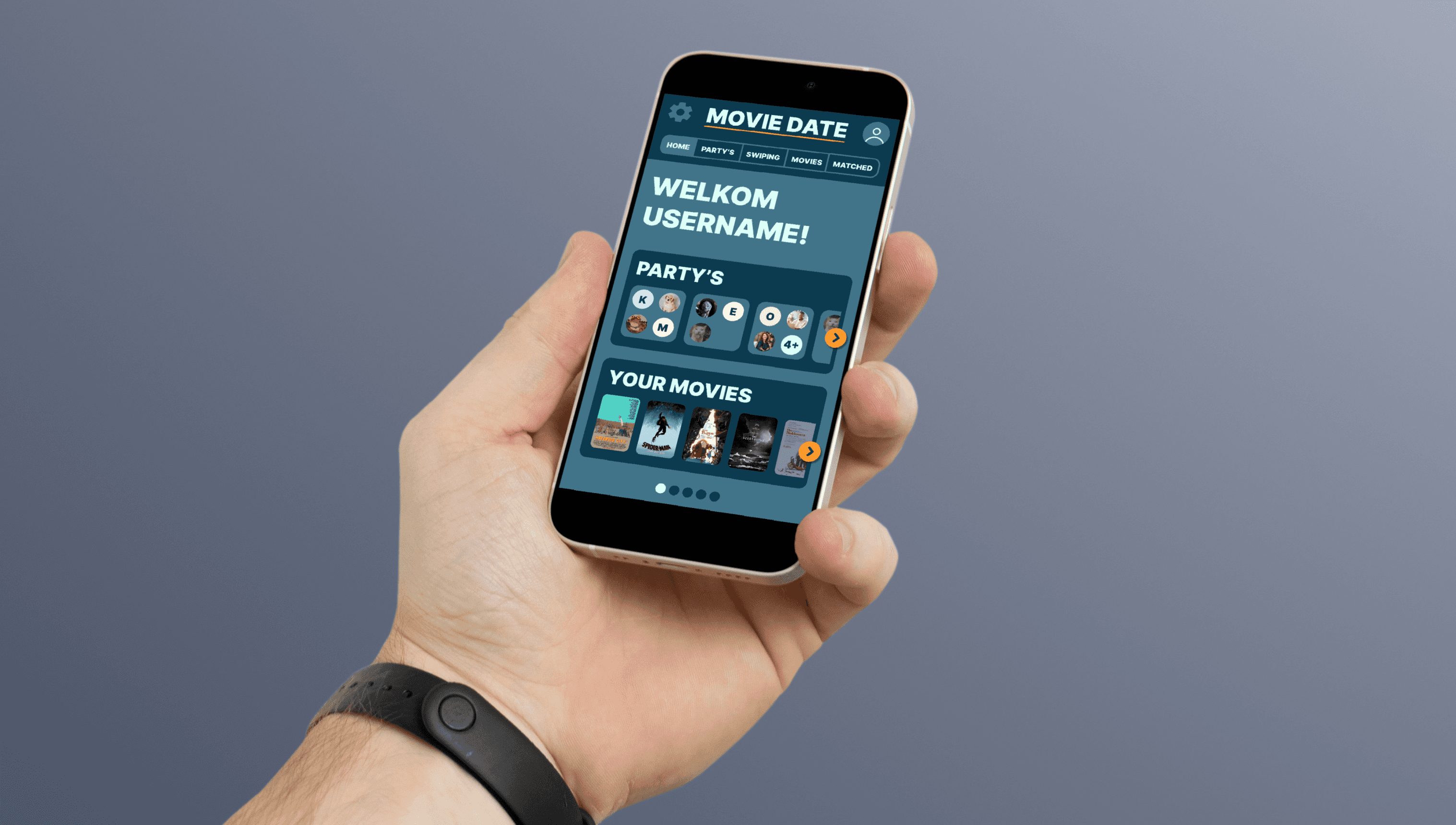
Because we were free to come up with an app idea, I chose something I'm very passionate about: watching movies. The concept behind Movie Date, is that when you have to decide on a movie with other people you can use the app to "swipe" movies (similar to dating apps). When everyone in a group has swiped right on the same movie, the app will say what movie everyone agreed on and you can begin your group viewing or watch-party.
Because we were free to come up with an app idea, I chose something I'm very passionate about: watching movies. The concept behind Movie Date, is that when you have to decide on a movie with other people you can use the app to "swipe" movies (similar to dating apps). When everyone in a group has swiped right on the same movie, the app will say what movie everyone agreed on and you can begin your group viewing or watch-party.
Versions
Versions
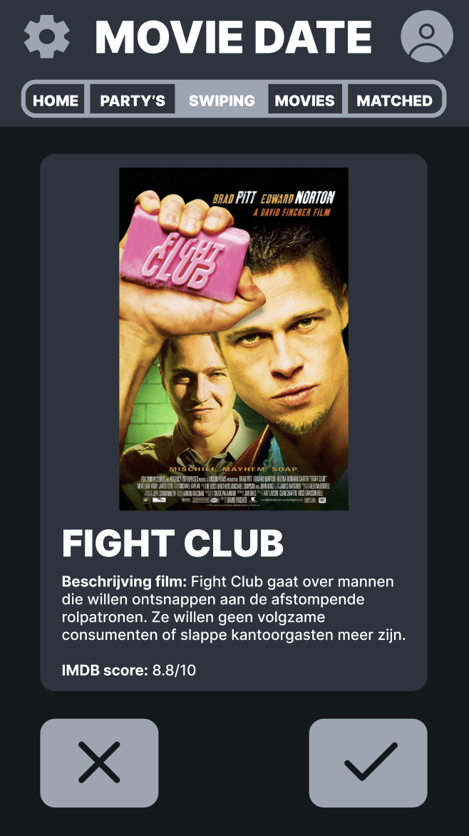
1. Black, white and gray
The first version I designed had a color scheme based on the app Letterboxd: an app that's also related to movies.
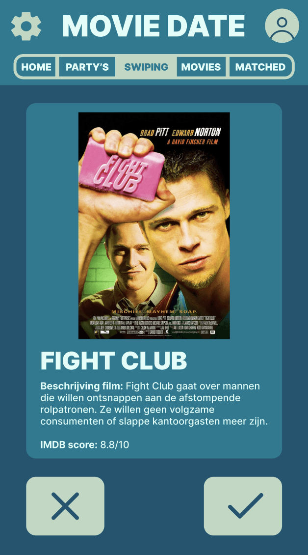
2. Finding blue
Because I wanted something more visually unique, I strayed away from the black and started experimenting with hues of blue.
3. Icon color
I realized that if I wanted to effectively guide users to certain buttons, the color of those buttons should stand out.
4. Layout
I changed the design to only feature the most important parts of the function. With all the other elements it could get distracting.
5. Going darker
Looking back to my first design, I wanted to keep a darker color scheme. So I tried some darker hues of blue.
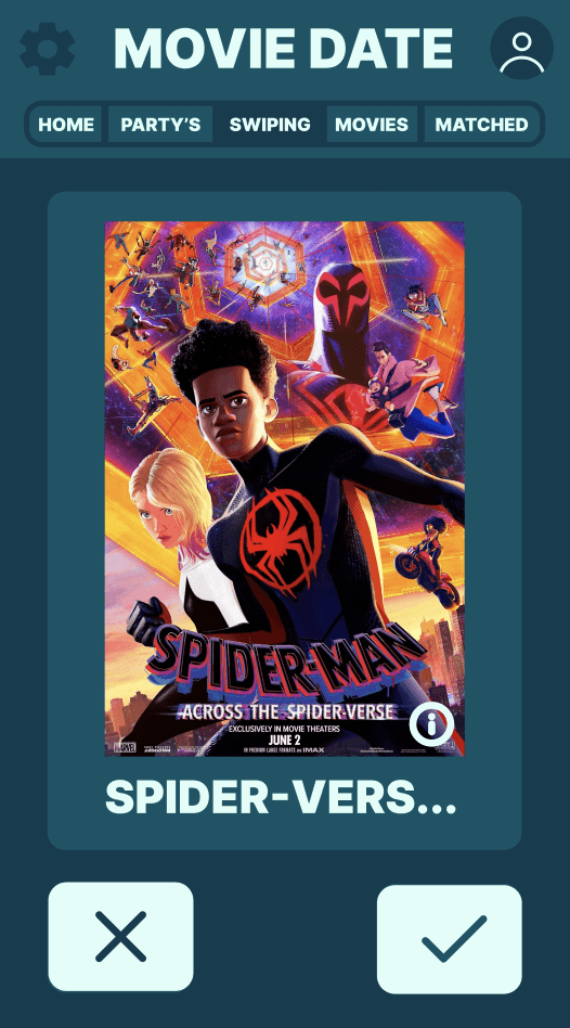
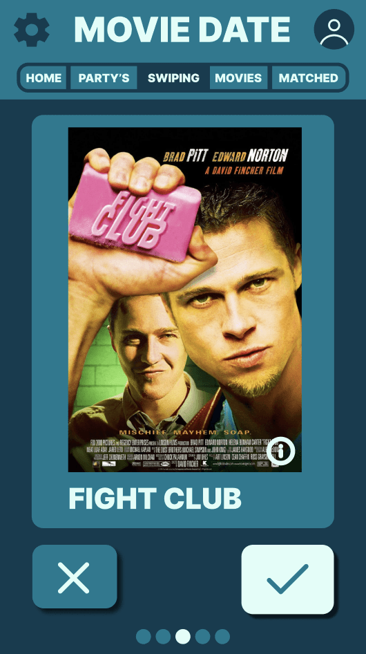
6. Do other movies fit?
To test if the interface was good, I put a couple of different movies in the template. So I'd know if longer titles or posters with other colors would be a problem.
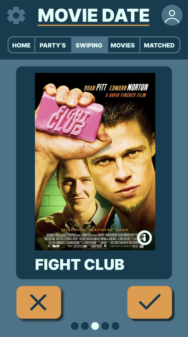
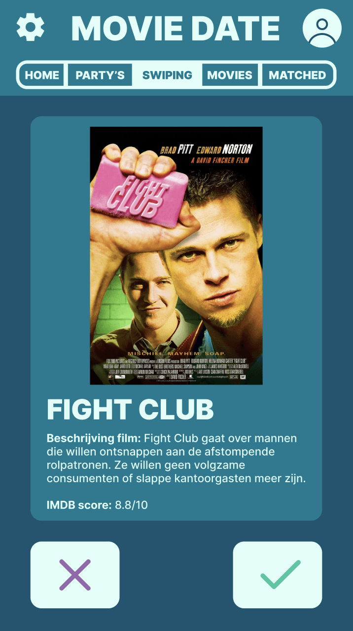
7. Adding orange
Finally I got the idea to add orange as an accent color. This works well because orange and blue are opposites on the color wheel.
1. Black, white and gray
The first version I designed had a color scheme based on the app Letterboxd: an app that's also related to movies.
2. Finding blue
Because I wanted something more visually unique, I strayed away from the black and started experimenting with hues of blue.
3. Icon color
I realized that if I wanted to effectively guide users to certain buttons, the color of those buttons should stand out.
4. Layout
I changed the design to only feature the most important parts of the function. With all the other elements it could get distracting.
5. Going darker
Looking back to my first design, I wanted to keep a darker color scheme. So I tried some darker hues of blue.
6. Do other movies fit?
To test if the interface was good, I put a couple of different movies in the template. So I'd know if longer titles or posters with other colors would be a problem.
7. Adding orange
Finally I got the idea to add orange as an accent color. This works well because orange and blue are opposites on the color wheel.
Final design
Final design
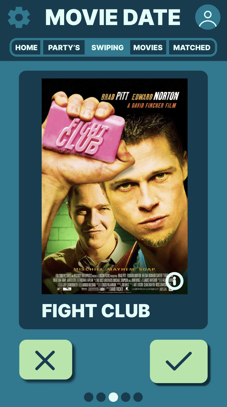
After trying many different options, I chose this color scheme because of the complementary contrast between blue and orange. By making the most important elements orange, they stand out more, while the blue elements are slightly less prominent. The idea behind this is that the user can immediately see which elements are important on each page, such as the buttons for swiping through movies.
After trying many different options, I chose this color scheme because of the complementary contrast between blue and orange. By making the most important elements orange, they stand out more, while the blue elements are slightly less prominent. The idea behind this is that the user can immediately see which elements are important on each page, such as the buttons for swiping through movies.
The colors accurately reflect how the app should be used and it looks good as a whole. And even though it wasn't part of the assignment, I'm also happy with the layout of the app I designed. Furthermore, this assignment allowed me to create something that reflects my own interests, which is always fun.
The colors accurately reflect how the app should be used and it looks good as a whole. And even though it wasn't part of the assignment, I'm also happy with the layout of the app I designed. Furthermore, this assignment allowed me to create something that reflects my own interests, which is always fun.