Branding for a beverage that exudes my
sense of nostalgia
Branding for a beverage that exudes my sense of nostalgia
Branding for a beverage that exudes my sense of nostalgia
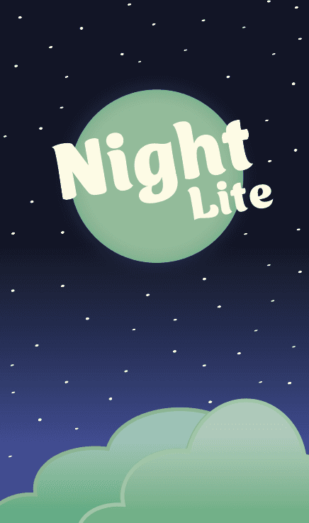
When asked to design a brand for a “nostalgic” beverage, I came up with Night Lite. The brand revolves around a cloudy night overseen by the moon. The elements I incorporated into the design, are based on my own idea of nostalgia, meant to represent a calm and melancholy night.
When asked to design a brand for a “nostalgic” beverage, I came up with Night Lite. The brand revolves around a cloudy night overseen by the moon. The elements I incorporated into the design, are based on my own idea of nostalgia, meant to represent a calm and melancholy night.
This was an exercise in branding, because not only did I need to make a good design, the design should also transcend mediums. I also had to take my target audience of young adults into consideration, so I had to combine their idea of nostalgia with my own.
This was an exercise in branding, because not only did I need to make a good design, the design should also transcend mediums. I also had to take my target audience of young adults into consideration, so I had to combine their idea of nostalgia with my own.
Moodboards
Moodboards
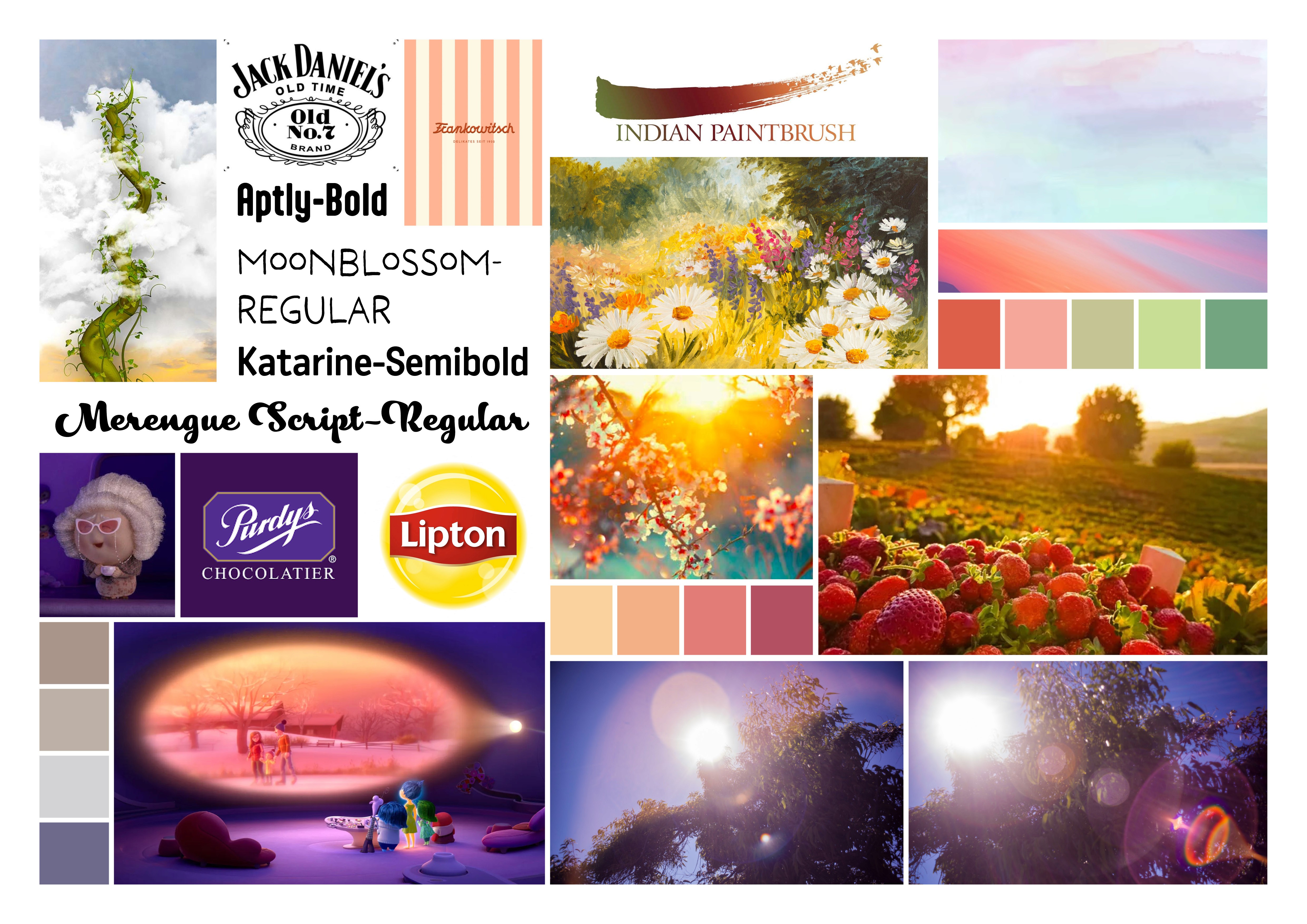
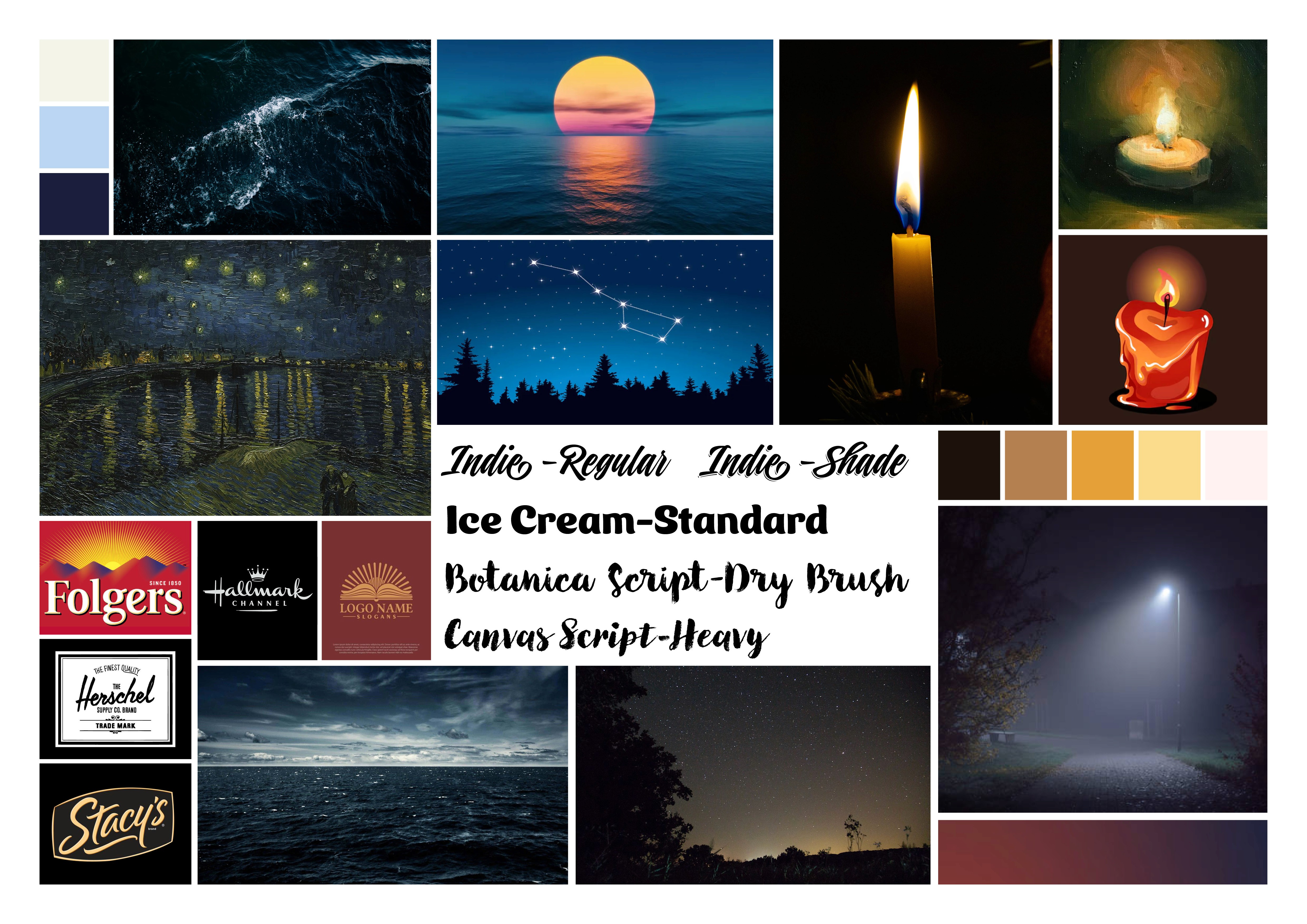
I created moodboards to map out my idea of what nostalgia really means. I kept compiled images of everything I associated with nostalgia. That's how I came up with the idea to incorporate a light-dark contrast into my design. That, to me, is what a nostalgic brand should The idea would become the common thread for the branding of the beverage.
I created moodboards to map out my idea of what nostalgia really means. I kept compiled images of everything I associated with nostalgia. That's how I came up with the idea to incorporate a light-dark contrast into my design. That, to me, is what a nostalgic brand should The idea would become the common thread for the branding of the beverage.
I created moodboards to map out my idea of what nostalgia really means. I kept compiled images of everything I associated with nostalgia. That's how I came up with the idea to incorporate a light-dark contrast into my design. .
That, to me, is what a nostalgic brand should The idea would become the common thread for the branding of the beverage
First steps
First steps
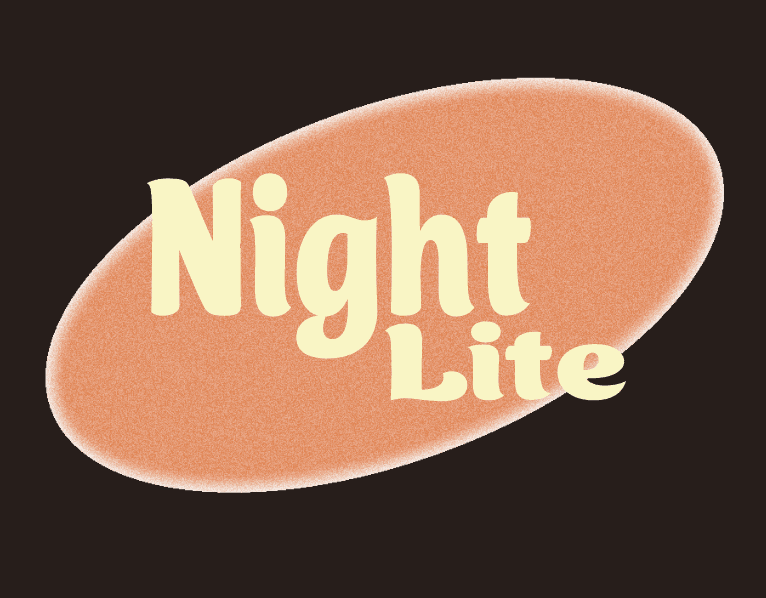
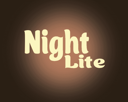
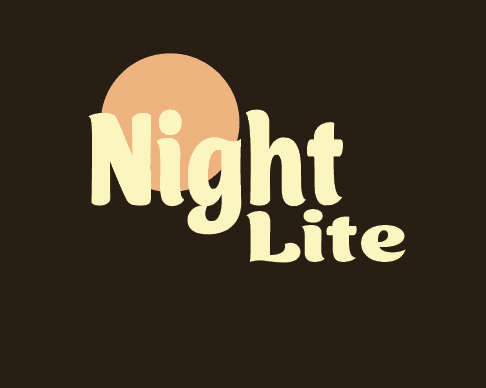
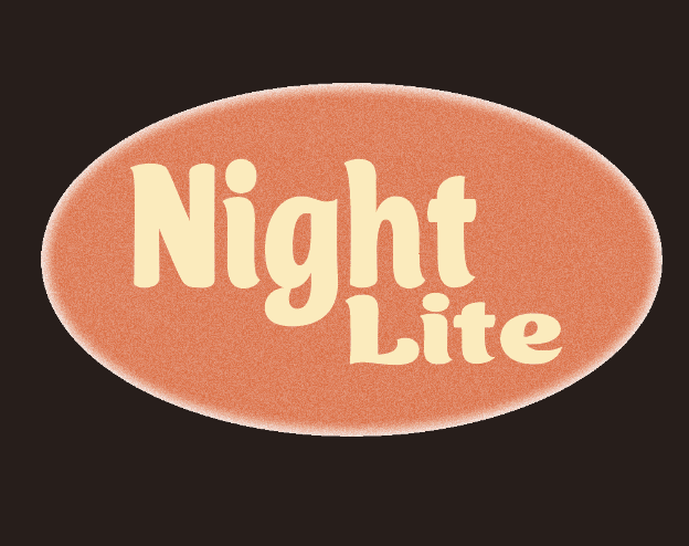
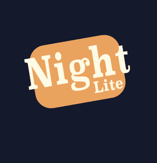
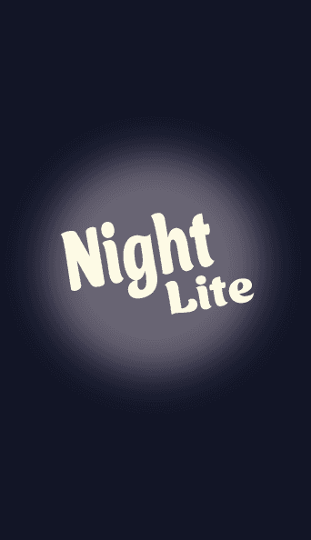
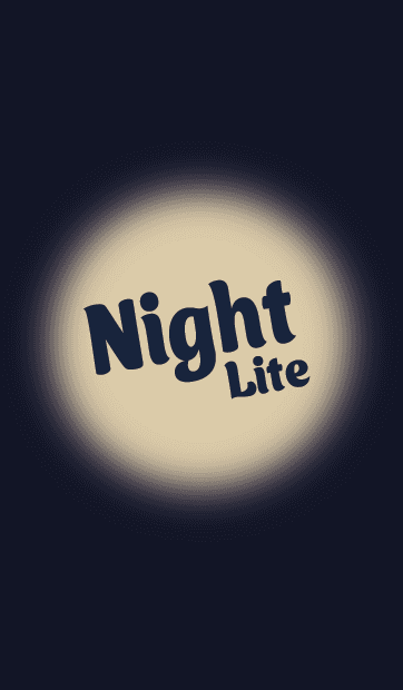
After I had made the moodboards and had determined what nostalgia means to me, I began on creating logo's based on the light-dark contrast I wanted to incorporate into the branding. The name came quite easily. The 'night' part of the name refers to the light in the dark and 'lite' is a term used to describe drinks with less sugar then usual. It's also a pun of the word 'Night Light'. I first tried to replicate the idea of a candle exuding light in a dark room, using mainly brown, orange and yellow.
After I had made the moodboards and had determined what nostalgia means to me, I began on creating logo's based on the light-dark contrast I wanted to incorporate into the branding. The name came quite easily. The 'night' part of the name refers to the light in the dark and 'lite' is a term used to describe drinks with less sugar then usual. It's also a pun of the word 'Night Light'. I first tried to replicate the idea of a candle exuding light in a dark room, using mainly brown, orange and yellow.
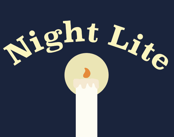
This didn't work for me, so I tried to a combination of blue and yellow. This time with the underlying idea not of candlelight, but moonlight. This concept stuck with me and coincidentally worked really well with the name I had come up with. I continued with this idea of capturing the night sky into a brand and experimented with gradients, different colors and how many clouds and stars should be present. Eventually, after many iterations, I came to the current design of Night Lite.
This didn't work for me, so I tried to a combination of blue and yellow. This time with the underlying idea not of candlelight, but moonlight. This concept stuck with me and coincidentally worked really well with the name I had come up with. I continued with this idea of capturing the night sky into a brand and experimented with gradients, different colors and how many clouds and stars should be present. Eventually, after many iterations, I came to the current design of Night Lite.
Final product
Final product
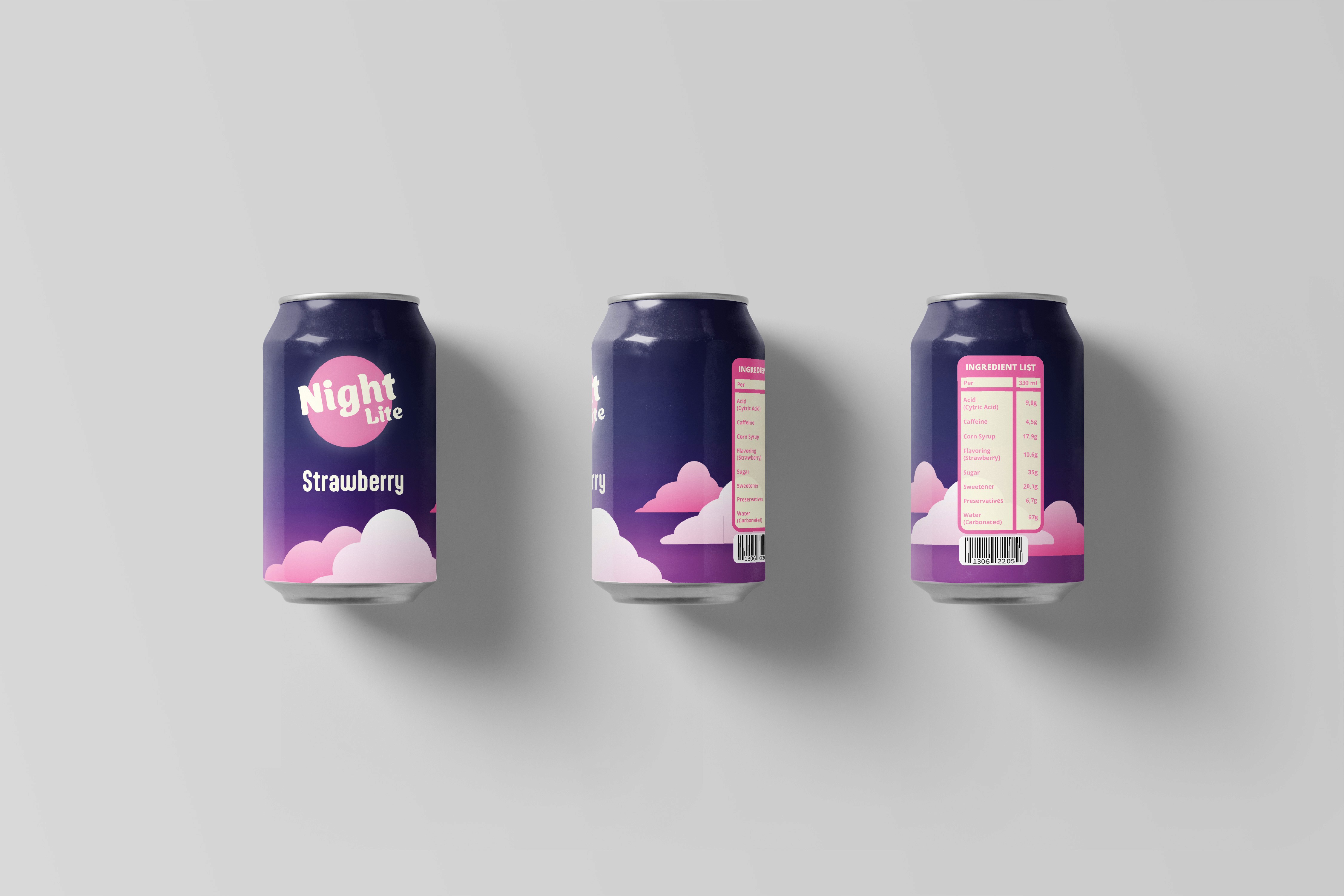
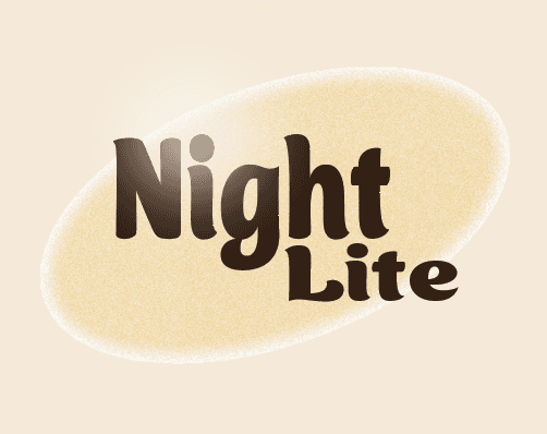
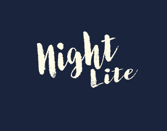
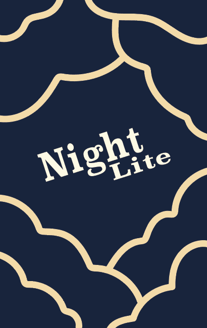
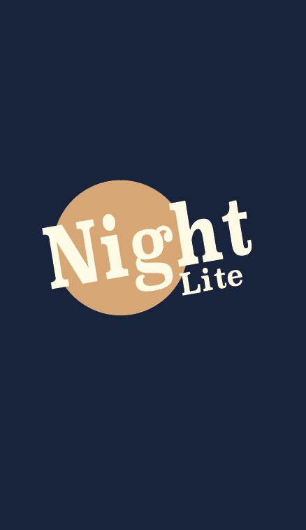
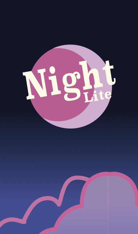
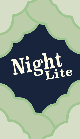
After considering many options, I ultimately decided to revolve the brand around a calm, melancholic, and cloudy night with the moon overhead. This is what nostalgia means to me. I chose to present the design in multiple colors because I wanted to see if my branding would still work if the brand wanted to expand.
After considering many options, I ultimately decided to revolve the brand around a calm, melancholic, and cloudy night with the moon overhead. This is what nostalgia means to me. I chose to present the design in multiple colors because I wanted to see if my branding would still work if the brand wanted to expand.
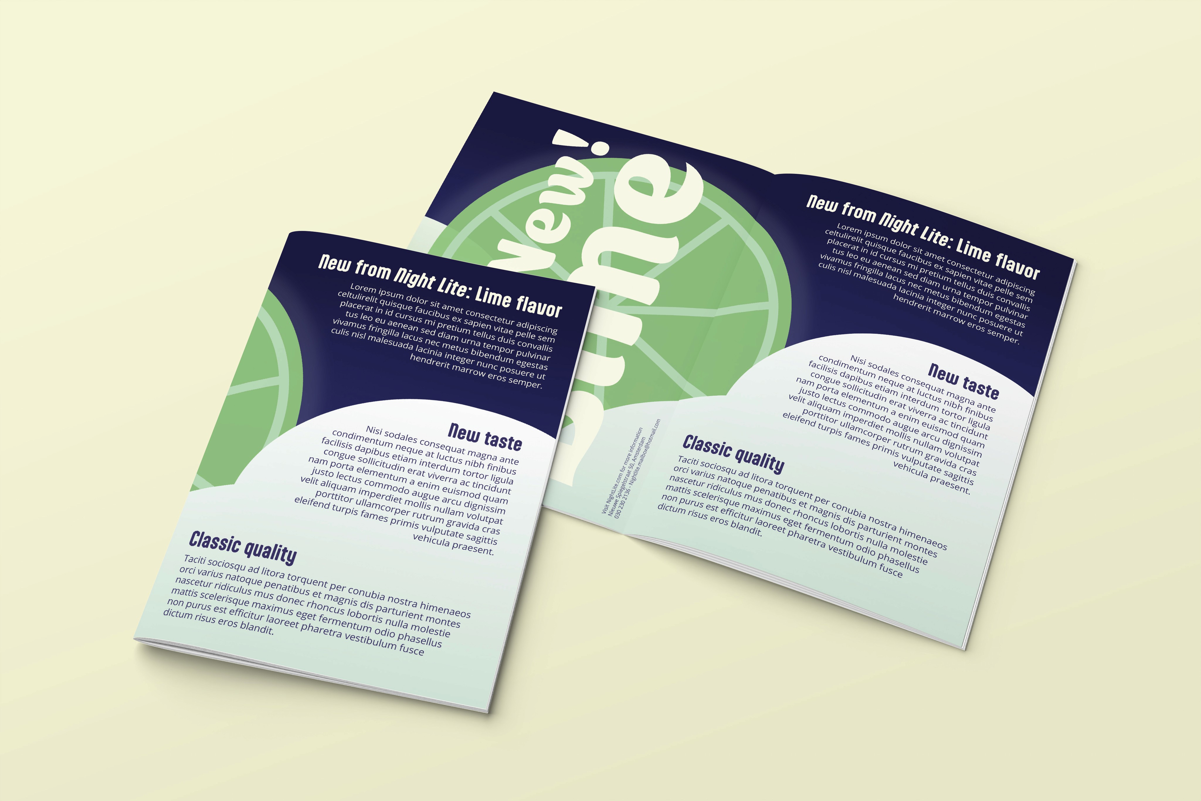
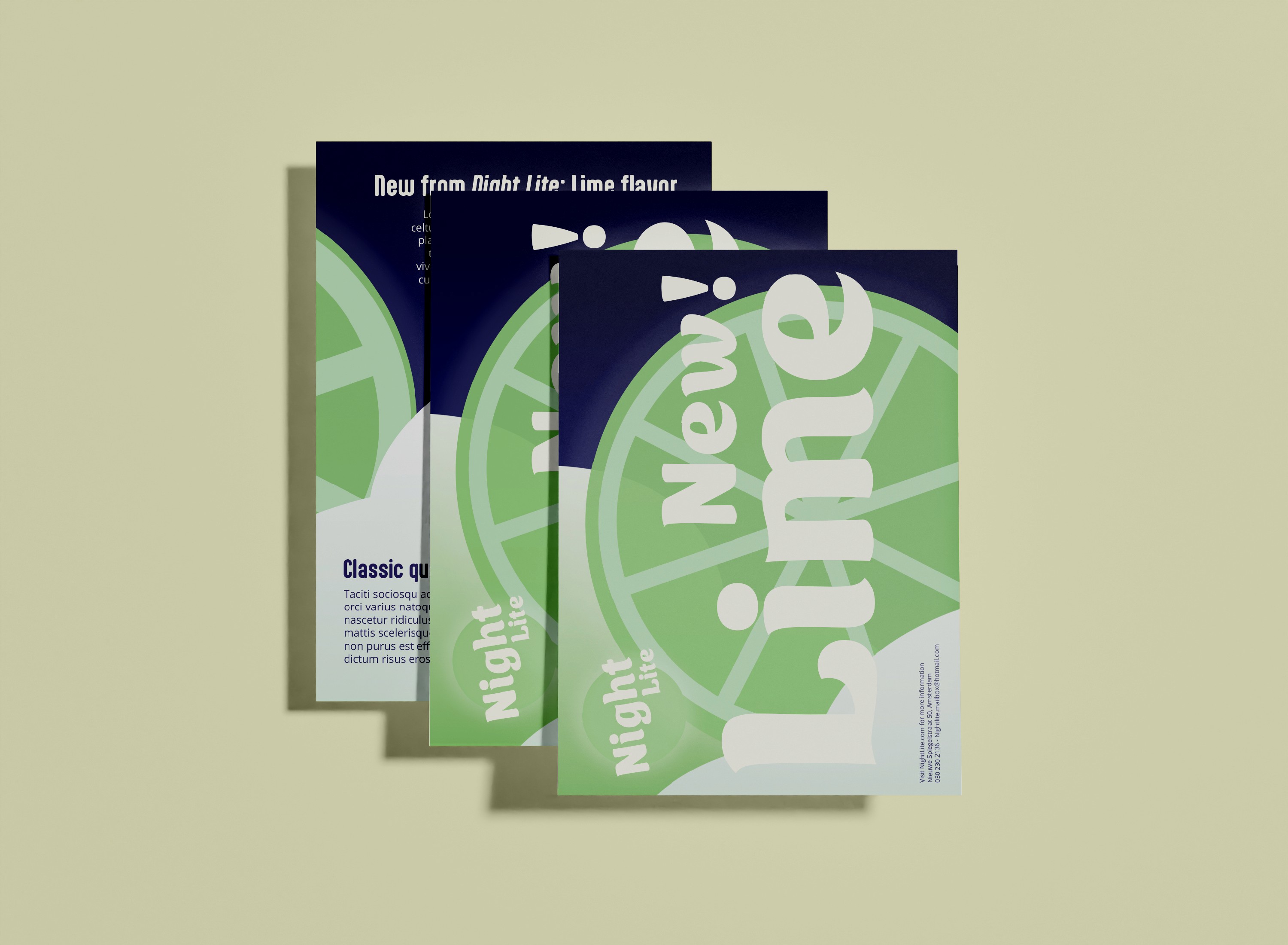
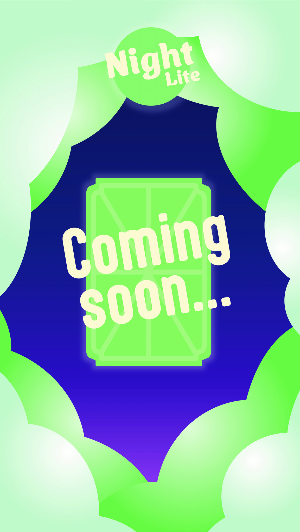
The colors represent different flavors (strawberry and lime). I have made a couple of mockups for the the brand. The first one is the can of the beverage itself with the strawberry flavor. I also made designs for a flyer and an Instagram post that feature the lime flavor.
The colors represent different flavors (strawberry and lime). I have made a couple of mockups for the the brand. The first one is the can of the beverage itself with the strawberry flavor. I also made designs for a flyer and an Instagram post that feature the lime flavor.